Sunday 9 October 2011

We've moved.

Hi all.

Some of you may be wondering why this blog hasn't been updated in like forever. Well, I decided a few months ago to try out Tumblr, and to my surprise it is in fact lots easier than this blogger thing and far more interactive.

So, aside from this post I probably won't be back here, and if any of you do wish to keep up with whatever I'm up to then please check out http://frazerirving.tumblr.com/ as that's where I'm living thesedays.

Maybe at some point I'll manage to get the frazerirving.com url redirected to the tumblr page, but that means actually remembering how to do it, plus I'll need to include an email link on that page as well. These things are so complicated for me on a Sunday morning.

Also, due to Apple closing down their Mobileme thing (to be honest, I was never really taken by it) the galleries I have linked to on this page will also be vanishing, in favour of a more eclectic and updated selection on the tumblr pages.

Ok, second breakfast has been consumed, now time to stretch and figure out what I'm doing today....


F

Friday 3 December 2010

Talking with Gods

Ahoy shipmates

Back again for a quickie. Am currently hard at work scribbling GUTSVILLE and trying to keep warm in this wretchedly early winter freeze. I have included 2 panels from the latest pages which is about all I can do right now without spoiling crucial details for you. I think.


I have also popped up again to mention those who are UK based and interested in that Grant Morrison documentary Talking With Gods, that I will be attending a panel at the ICA on behalf of the Comica festival on the 12th of December which is all about the movie. And Stuff and Things. I'll be up there with Rian Hughes and director Patrick Meaney commenting on how strange our faces look when they're broadcast 20ft high.


Ok, back to the pages.

F

Wednesday 10 November 2010

Kults!

Hello again!

Yes it's that time...that time being "time to show some art and talk a load of shite" again.
Last time I was here I showed some cover sketches and ting from the Batman and Robin issues I did, and at the end I promised to return with some interior page sneak peeks. 
Well, there's been a slight change in that plan. Not in a bad way as such, as I still plan to show some of that stuff to those of you who are enjoying peeking under the Wizard's skirt, but before I get here I have decided to show something different.

A little while ago I was asked very nicely if I would be interested in doing a variant poster for a movie called "MONSTERS". Being the shameless art-whore that I am, I said yes. I got a dvd of the flick, watched it, then set to scribbling some ideas. Here I present to you the final product along with the rejected ideas I had after watching the movie.


This is the final version. As u will see later, it's pretty close to one of my sketches, and that's the way I like it. I had to smooth out some bumps and creases on the figures before it was ready but in doing so I learnt a few new tricks when it comes to rendering skin.

This was an earlier rough of the final idea. I had been given suggestions to pull back from my sketch and show it more from above...this, I thought, reduced the dramatic engagement with the central characters and made it more of scenic piece (and I suck at scenery) which is why I was glad that we ended up reverting to the original sketch in close up.

Despite the movie beiong called MONSTERS I didn't think the tentacle was enough of a draw for the drama in the poster. The symmetry in the shadow was nice, and I even liked the foliage, but the figures were TINY.

Earlier sketches were very different. I liked the romance aspect of the movie and initially went for a vibe that focused on that instead of the sci-fi-beasty aspect. When/if you see the movie you will see where I was coming from.

One of my great moments of graphic inspiration (rare as they may be) I had this brilliant idea of kinda forcing a heart-shape into the image. Like, it's a romance, yes? So how about putting a big soppy heart in there? It's actually way harder than you would think to make a heart-shape out of two linked hands, but I tried.

Different angle here. I liked the contrast between the warm hands which are like all lovey-dovey and sweet and nice and hopeful, with the cold blue mess of the wrecked jungle and the ominous signs of Monsters, such as the sign post and wrecked vehicles etc. 

A slight variation, rehashing an earlier pose. This time showing them in the jungle as opposed to approaching it, with some dramatic up-shots of wrecked buildings. Personally I wasn't so hot on this, as I really liked the tension of the earlier images as the couple approach the dangerous zone. It made them more heroic and sorta showed that the bond between them was stronger. This looks like they're just a bit lost on safari.

This sketch was the Chosen One. We ditched the sign post after a while, and replaced it with the tentacle. After all, there had to be something that said "Monster" in the image, and I wasn't sure that the looming shadow was enough. This shot does allow for more direct dramatic engagement with the characters, which is fair, even if I had to ditch my genius heart-shaped hands idea *grumble*.

This sketch was done with the idea that we will show the beasts in the background. It's less dramatic than the others, and the butt-shot is open for abuse across the internet.

The final sketch I offered up. It has all the ingredients I wanted in it (yes, I was even planning to highlight their heads to force a heart-shape in it) but it just wasn't very Ooomphy it seems. Still, it got me out of drawing lots of wreckage (am not a fan of wreckage).
There's a competition currently running to win signed copies of the poster at this website and you can all go watch the movie as well and then come back here and tell me which sketch you thought suited it best.


That's not all tho! After I did me Batman pages a few weeks ago I got another gig doodling a book cover for my mates at Solaris books. Essentially I had to design the character from the rough descriptions from the writer and make a design that would work as an intro to the series. I did 2 sketches, here is the one that made it.

Nice and simple, very much in keeping with what I normally do. The dude needing beefing up tho. "Imagine he had a very very very large paper-round" was the instruction. 

Ok, he has more meat. 

A little scribbling later and this is the b/w version. I modified my method during this, and this cover was my first proper experiment. I think it worked ok...

Final art sans text. This was leaked to Bleeding Cool yesterday and Rich Johnston added that I should return to drawing Gutsville now. HMPH! The audacity of the man! I am in fact currently doing just that, and will maybe post some previews and sneak peeks if you're nice. I'm looking at *you*, Johnston...

Many thanks also due to The Queen of Cakes for proofreading and correcting my atrocious typing xxx


Monday 8 November 2010

Back in town

Greets

Yes it's been ages since I last blogged. I'm beginning to see that I only do this when jobs are done and I can show stuff without getting my head bitten off, tho I will try to do more. Hey, I pay for the domain name after all. 

Since we last met I have been doodling ferociously at Batman and Robin. It took me all summer and I am very proud of it. Apparently lots of people out there had never heard of me before they read that comic, so it's a good thing I drew it. All egomaniacs like minions, and I am no different.
So to celebrate that series ending I figured I'd show you lot some of the sketchy things that are a by-product of the creative process. For this post we're going to have a look at the last 2 covers I drew for the series in various states of undress.


Pencil work for issue 14. I say Pencil, but it's not really. It's all pixels, tho it also looks a bit like marker pens. I like the old school feel of pencils and pens so i choose to work this way. Makes me feel at one with the traditionalist hiding inside me under lots of warm duvets.


Misty Batman. I tried a bunch of different tricks to create depth with this cover, and this was one of them. It felt a bit busy to me tho, so I ditched it.


This is the colour sketch I sent the boss for approval. I know!! These people have amazing skill at deciphering scribbles.


Purple Batman. I almost went with this one, cos I liked the unified colour scheme, but the original contrast with the green was too alluring. Those of you who have the comic will know how it turned out. Those of you who don't...well, I don't know what to say really...;_;


Here's my 3rd cover with the Joker, and lots of pink people busting out of his head.


During an earlier stage of madness I went with a crazy background. Nausea followed so I ditched it.


This is Chuckles in his "inked" stage before any colours or backgrounds are added.


This is him all pencilly with scribbles of the mad things popping out.


Pencils. I really should stop calling it that shouldn't I?


And here's the rejected sketch I sent out first. Hey I liked it. However the crazy head popping won the day and there you have it.

Next time I visit here (soon I hope) I will show some pages from the series all broken down into rough and scribbly stages, as well as some Gutsville previews. Yes, I'm drawing it again, this time I won't stop till it's finished!!!

Time for tea now.

F

Wednesday 14 July 2010

BATMAN

...and Robin.

Hello, friends. Yes I hardly ever blog here, but that's because I are too busy doodling or trying to tidy Irving Towers to sit down and compose my thoughts. It's not because I don't want to...those of you who know me will be well aware of exactly how much I can talk and how many opinions I have on everything, not to mention the seemingly endless stream of anecdotes cribbed from other people that I never tire of repeating. Oh and the bad jokes.
But blogging is different, as I feel I need to show something pretty as well as waffle on endlessly. A lot of that is controlled by the release dates of work I have been making, which is how I come to be here now: since the last post I have been working on some Batman comics, the first being The Return Of Bruce Wayne issue 2 (which came out a coupla months back, cover is posted below) and the other one is issues 13-15 of Batman and Robin, which has only just been published.
So now that the cat is semi out of the bag, I can dish out some more sketches and doodles for you to while away the minutes with.

Here be the first sketch idea submitted. The brief was quite broad...basically "an iconic image of Batman and Robin" which had me scratching my head for a while because such broadness usually leaves me staring at blank pages for days. I decided something simple, with the feisty new Robin charging angrily at the reader whilst the new Batman kinda hangs back and does his mentor thing. This sketch was kinda nice in that it showed that Robin was far more unruly than the older Robin, pushing Batman's cape aside so he could charge at us.

Unhappy with the lopsided composition of my first sketch, I did something simpler and more symmetrical with far less narrative aspects. Not knowing what the contents of the issue would be at this time I couldn't draw anything that related to any actual events so it had to be really basic. It kinda referenced some very early Batman images, with the cape flowing out in a Dracula-esque manner and the beaming lines in the background...possibly from the old 60s Batman TV show...and ultimately this one won the battle and so then all that remained was to render the thing.


First up was drawing Batman. Thanks to the magic of Potatoshop I can draw entire characters on separate layers and compose them later, which saves much hassle and time spent re-editing images if stuff looks out of place. My take on Batman was still forming at this point in time, but I had already decided that the cape and cowl would be far darker that current versions, more of a black than a blue except when strong light is blasted onto it. The face was tricky, as I knew this Batman had to look different than the Bruce Wayne I was drawing in the other book at the time, so I chose a slightly different jaw shape than ol' Brucie.


Less Dredd, more...er...well, slightly pointy chin and pouty lips.


Sketching in Robin, I modified the expression to be less snarly and more frowny at the request of the Boss. Even tho he's 10 years old I figured his build would be more developed than the normal 10 yr old, what with all the crimefighting and stuff. And hey, he's Bruce Wayne's kid. 


This is what I ended up with after the first day. The bright shapes of Robin's face and cape popping out of the shadow of Batman's cape etc. It still wasn't quite what I had in mind so a simple tweak...


...and the cape shape changes to give it a little dynamic that the original lacked. the final version printed a little darker than it appeared on my screen (a situation that has now been remedied) so the rich oranges in the background didn't throb quite as much as I expected, but the overall contrast worked fine with the head and the cape, so I was satisfied.

Man, there's so much art I could show you Dear Internet, but alas I cannot until it has seen the light of printed day, so you will have to wait to peep behind the artist's curtain for that.

Before that day passes, however, I will be attending the San Diego ComiCon, or SDCC as twitter likes to call it. I have a few spots where I'll be sitting down and signing stuff, yakking and waffling as I do, so the current list of commitments is thus:

Friday 23rd July I'll be on the Batman: The Return panel at 1:45 till 2:45 in room 6DE, then after that I'll be signing at the DC booth from 3 till 4 pm.

Saturday 24th July I'll be signing at the DC booth from 11am till noon, and then I'll be at the Roddenberry booth signing from 1:30 till 3.

Sunday 25th July I'll be at the Roddenberry booth again from 10:30 am till noon.

That's all so far, as more stuff gets lined up I'll update this page. Ok, now it is lunchtime.

F

Thursday 8 April 2010

Androids

Howdy all! Well, now I have managed to fix the magic buttons that I used to make stuff happen up here on the net I can resume service, with pictures and nonsense at no extra charge!

Since I was last here properly I have been kept busy making art for many different things and people, from the mighty DC Comics to the awesome Marvel Comics, via the mercurial Archaia Press and stopping a good few times on the doorstep of the incredible Gutsville, tho the milk bottles and newspapers have piled up a bit there due to my absence. Hey, a dude's gotta pay the bills, and that Council Tax is a killer! Along my travels I have encountered many awesome things, including (but not limited to) Dr Strange, Batman, Tentacled things, Naked Ladies, Naked Men, Nanobots, ferrets and some sharks, and I will be displaying some of them on these here virtual pages over the next few weeks/months in the interests of enlightenment and promotion.

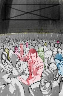
To start with tho, we have this little cover illo I drew for Boom! Studios. It was a variant cover for issue 10 of their adaptation of "Do Androids Dream Of Electric Sheep?" or "dadoes" as I came to know it.

The brief was open, as long as it related to the story. I went with the simple idea of Deckard hunting Replicants in a huge crowd, and using colour to reveal which ones were normal and which ones were not. deckard himself also appears in colour, which is my nod to the ambiguity of the movie version where we were all left wondering "Hey, is he a robot too?". I admit, I never found out.

My editor (the Brilliantly named Ian Brill) said it was cool and it was all speed ahead on the finals! He will tell you that it did in fact take a while for me to get the final art done, which is in fact totally true. But the deadline was still met, and the book came out months later so it was all cool. Hey, there were reasons why it took so long: there's lots of fiddly people in it! I don't normally "do" detail but in this case I kinda had to, and it started slow.


Obv the main folks need the most detail, and what with this being a departure from Gutsville (which is what I had been working on at the time) it took a while to get the vibe. Please note the cute chick on the right. She is my "assistant"and has featured in some other comics I have made recently. 


As you can see above, the crowd is filling out. Tho I had real issues with who to populate it with! Even tho most will be specks, they had to actually *be* people, and it frazzled me little brane! I am not a natural Judge Dredd artist for this very reason, tho I do reckon the more of this I do the better I get at it. Next crowd scene I get, I will explore this.


Here's what I ended up with after aaaaages: a nice monochrome crowd scene with some blobs in the distance and some spooky shadows for buildings! All that remained was to add colour! And thanks to the magic of Photoshop CS4 (which is currently crashing far too much at the moment ¬_¬) this was easy.


Singling out the replicants was pretty much all the hard work I had to do at this stage, tho I did have issues regarding *what* colour to paint them. In the sketch they're all different colours but that didn't work as it made everything complicated. Hence the standard of "sorta reddish".
And for the arty ones among you, I have included 2 closeups of sections that I find interesting.


Anyway, I got bed to be going to. And when I awake, I have Bat-stuff to draw! Yaaaaaay!!!! Until next time, when I shall probably expose some secrets behind the art of the Bat-covers, I bid ye all a good-day or a good-night :)

F

Thursday 25 March 2010

Angry

Ok let's keep trying...


does this all work? ?_?

Ok apparently it does!! thanks to Cameron Stewart (fellow doodler on The Return Of Bruce Wayne and Batman And Robin) I have utilised the magic of a redirect page to send you people here!! Aw man, what HASSLE. I'm an artist, not an abacus! Ok now I can plan to post up some art that I have made since I was last here. Back soon. Promise.

F